
Total, Average and Marginal Revenue Curves Explained for SHS 2 Economics (Sem. 1 – Week 10)
A table of revenue figures tells us what happens at different quantities. A graph allows us to see the pattern. This is the purpose of revenue curves: they turn TR, AR and MR data into relationships that can be interpreted visually.
Three Revenue Curves, Three Questions
| Curve | Question it answers | Vertical measure |
|---|---|---|
| TR | How much total revenue is earned? | Total Revenue |
| AR | How much revenue is earned per unit? | Average Revenue |
| MR | How much additional revenue comes from more sales? | Marginal Revenue |
For all three curves, quantity sold is represented on the horizontal axis.
Why the TR Curve Matters
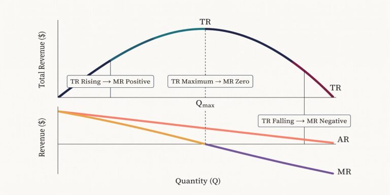
Total Revenue traces the total income earned as the quantity sold changes. Its shape contains information about marginal revenue because the slope of the TR curve corresponds to MR.
The Three Key Moments
- When TR is increasing, its slope is positive and MR is positive.
- When TR reaches its maximum, its slope is zero and MR is zero.
- When TR begins to decrease, its slope is negative and MR is negative.
Reading a Revenue Table
Consider the following values:
| Q | TR | AR | MR |
|---|---|---|---|
| 1 | 10 | 10 | 10 |
| 2 | 18 | 8 | 9 |
| 3 | 24 | 6 | 8 |
| 4 | 28 | 4 | 7 |
| 5 | 30 | 2 | 6 |
| 6 | 30 | 0 | 5 |
| 7 | 28 | −2 | 4 |
| 8 | 24 | −4 | 3 |
| 9 | 18 | −6 | 2 |
| 10 | 10 | −8 | 1 |
The TR figures rise to 30, remain at 30 for Q = 6, and then decline. The AR figures move downward from 10 to −8, while MR falls from 10 to 1.
How to Turn the Table into a Graph
- Place Quantity (Q) on the horizontal axis.
- Choose a vertical scale that accommodates the revenue values.
- Plot each TR value against its quantity.
- Plot the AR values on the same quantity scale.
- Plot the MR values.
- Join the points appropriately and label each curve.
The exercise is not simply about drawing lines. The finished graph should allow you to explain what happens to revenue as quantity changes.
What the Graph Tells You
The most important relationship is between TR and MR. The direction and steepness of the TR curve provide information about marginal revenue. This means a learner can look at the TR curve and use its slope to interpret whether MR is positive, zero or negative.
A Closer Look at the Data
From Q = 1 to Q = 5, TR increases from 10 to 30. At Q = 6, TR remains 30. After Q = 6, TR falls: it becomes 28 at Q = 7, 24 at Q = 8 and 10 at Q = 10.
Meanwhile, AR falls from 10 to negative values, while MR declines progressively from 10 to 1. These movements can be displayed graphically and then used to explain the relationships among the three revenue measures.
From Data to Economic Understanding
A revenue table gives individual values; a graph reveals their pattern. By plotting TR, AR and MR, the relationship between total revenue and marginal revenue becomes especially clear. The graph therefore becomes a tool for explaining, not merely displaying, revenue information.
Quick Review
- TR curve: relationship between total revenue and quantity sold.
- AR curve: relationship between average revenue and quantity sold.
- MR curve: relationship between marginal revenue and quantity sold.
- TR rising: MR is positive.
- TR at maximum: MR is zero.
- TR falling: MR is negative.
Access NaCCA-aligned Support Packs
Download your structured NaCCA-aligned Teacher Support Pack and Student Learning Pack, designed for clarity, practicality, and reliable teaching and learning.