Total, Average and Marginal Revenue Curves
1. From Revenue to Revenue Curves
Revenue can be studied not only through calculations but also through graphs. The three important curves are the Total Revenue (TR), Average Revenue (AR) and Marginal Revenue (MR) curves.
| Curve | What it shows | Vertical axis | Horizontal axis |
|---|---|---|---|
| TR | Total revenue earned from sales | Total Revenue | Quantity sold |
| AR | Revenue earned per unit sold | Average Revenue | Quantity sold |
| MR | Additional revenue from selling more units | Marginal Revenue | Quantity sold |
2. Understanding the TR Curve
The TR curve shows how total revenue changes as the quantity sold changes. The quantity sold is placed on the horizontal axis, while total revenue is placed on the vertical axis.
3. The Key Relationship Between TR and MR
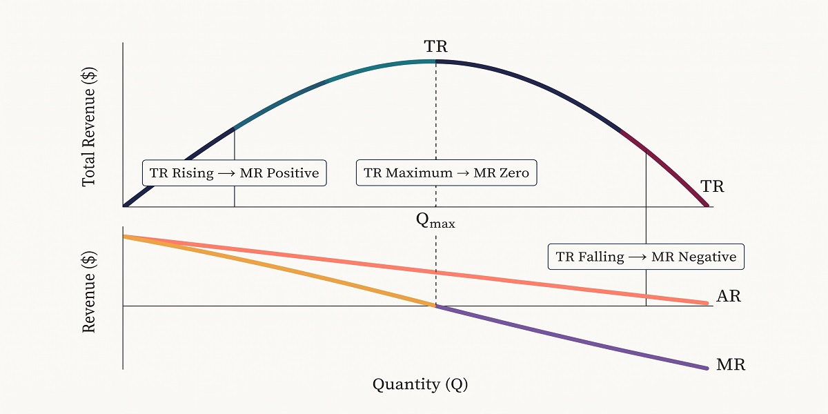
The slope of the TR curve corresponds to MR. This gives us three important relationships:
- TR increasing → MR is positive.
- TR at its maximum → MR is zero.
- TR decreasing → MR is negative.
4. The AR and MR Curves
The AR curve shows revenue per unit sold, while the MR curve shows the additional revenue earned from selling another unit. Both use quantity sold on the horizontal axis.
The example below provides the data needed to sketch all three curves.
| Quantity (Q) | TR | AR | MR |
|---|---|---|---|
| 1 | 10 | 10 | 10 |
| 2 | 18 | 8 | 9 |
| 3 | 24 | 6 | 8 |
| 4 | 28 | 4 | 7 |
| 5 | 30 | 2 | 6 |
| 6 | 30 | 0 | 5 |
| 7 | 28 | −2 | 4 |
| 8 | 24 | −4 | 3 |
| 9 | 18 | −6 | 2 |
| 10 | 10 | −8 | 1 |
5. How to Sketch the Curves
- Draw a horizontal axis and label it Quantity (Q).
- Draw a vertical axis and label it according to the revenue measure being plotted.
- Choose an appropriate scale that accommodates the largest positive and negative values.
- Plot the TR points from the table and join them smoothly.
- Plot the AR points and join them smoothly.
- Plot the MR points and join them smoothly.
- Label each curve clearly.
6. Read the Data Before Drawing
Look at the TR column first. TR rises from 10 at Q = 1 to 30 at Q = 5 and remains at 30 at Q = 6. It then falls to 10 at Q = 10.
This pattern agrees with the MR values: MR remains positive throughout the table, while the TR curve reaches its maximum at Q = 5 and Q = 6. At Q = 6, the table gives AR = 0, while MR is still 5.
7. Explain the Curves
After plotting the data, use the curves to explain how the three revenue measures are related. The key relationship to remember is that MR corresponds to the slope of TR. A rising TR indicates positive MR, a maximum TR corresponds to zero MR, and a falling TR indicates negative MR.
8. Practice
Using the table above:
- At which quantity does TR first reach 30? Q = 5.
- What is TR at Q = 6? 30.
- What is AR at Q = 7? −2.
- What is MR at Q = 8? 3.
- What happens to TR after Q = 6? It decreases.
9. Bring It Together
TR shows total sales revenue, AR shows revenue per unit and MR shows additional revenue from a change in quantity sold. Graphing the three measures makes their relationships easier to see, especially the relationship between the slope of TR and MR.
Access NaCCA-aligned Support Packs
Download your structured NaCCA-aligned Teacher Support Pack and Student Learning Pack, designed for clarity, practicality, and reliable teaching and learning.