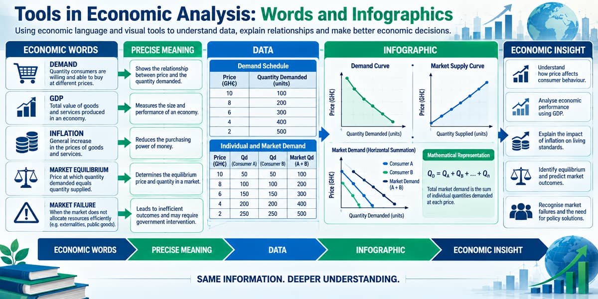
Tools in Economic Analysis: Words and Infographics Explained for SHS 2 Economics (Sem. 1 – Week 1)
Economics has its own language. It also has its own ways of turning complicated information into forms that people can understand quickly.
Two of the simplest and most useful tools are words and infographics.
Why Economic Language Matters
Ordinary conversation often relies on words whose meanings depend on context. Economics requires greater precision.
Consider the word demand.
In everyday speech, demand can mean an insistent request. In Economics, however, demand refers to the quantity of a good or service that consumers are willing and able to purchase at various prices over a given period.
That difference illustrates the importance of economese: specialised language gives economic ideas precise meanings.
A Vocabulary for Understanding the Economy
| Term | Economic meaning |
|---|---|
| GDP | A measure of the total economic output of a country. |
| Inflation | The rate at which the general level of prices for goods and services is rising. |
| Unemployment rate | The percentage of the labour force that is without work but actively seeking employment. |
| Market equilibrium | A state in which supply matches demand. |
| Market failure | A situation where a market operating on its own does not allocate resources efficiently. |
These terms allow economists to discuss economic conditions without having to describe an entire concept every time.
Words Can Also Tell a Story
Economic analysis is not limited to single words.
A complete sentence can describe a relationship between economic variables.
The law of demand provides an example. Holding other things constant, a higher price is associated with a lower quantity demanded, while a lower price is associated with a higher quantity demanded.
In a single statement, an economic relationship has been communicated clearly.
When Data Become Too Large for Words
Words are powerful, but economic information can become difficult to interpret when there are many observations.
This is where infographics become useful.
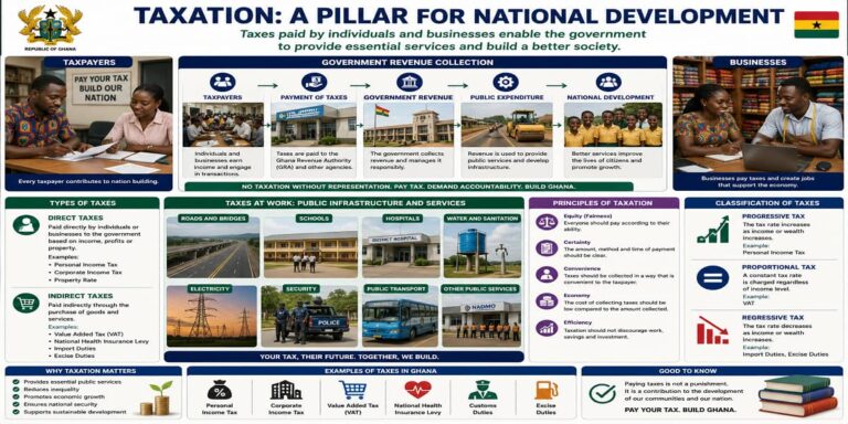
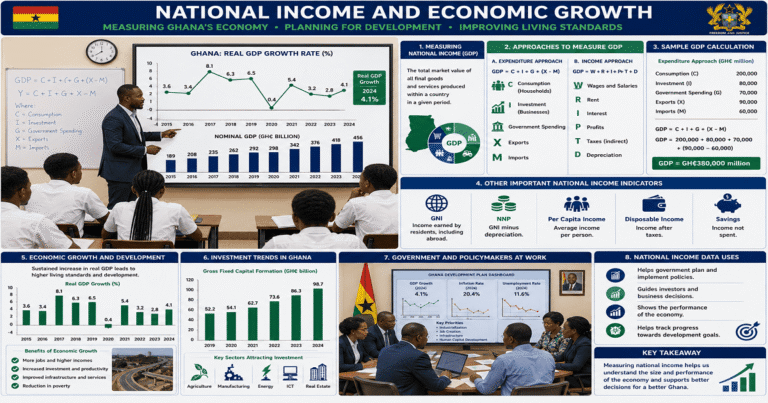
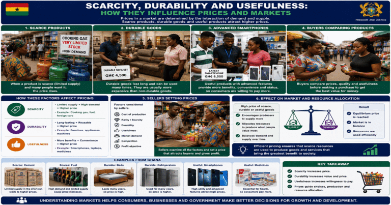
An infographic is a visual representation of information, data or knowledge designed to present complex information quickly and clearly.
Charts, graphs and maps can turn large amounts of information into visible patterns.
Seeing Demand Instead of Merely Reading It
Consider a consumer’s demand for Gobe (Gari and Beans).
| Price (GH₵) | Quantity Demanded (Bowls) |
|---|---|
| 5 | 10 |
| 7 | 8 |
| 12 | 7 |
| 15 | 5 |
| 20 | 3 |
| 26 | 2 |
| 30 | 1 |
There is an immediate pattern: as price rises, quantity demanded falls. A graph can communicate this pattern more quickly than a list of seven observations.
From Consumers to the Market
Individual behaviour can be combined to reveal the behaviour of a market.
Market demand is the total quantity that all consumers are willing and able to purchase at different prices during a specific period.
The calculation is straightforward:
Market demand = Individual demand 1 + Individual demand 2 + Individual demand 3 + …
For four consumers, consider the following example:
| Price (GH₵) | Esi | Adwoa | Yaw | Fiifi | Market Demand |
|---|---|---|---|---|---|
| 10 | 10 | 12 | 8 | 7 | 37 |
| 18 | 7 | 10 | 7 | 5 | 29 |
| 22 | 5 | 7 | 5 | 4 | 21 |
| 30 | 3 | 5 | 3 | 2 | 13 |
| 35 | 2 | 3 | 1 | 1 | 7 |
| 42 | 1 | 2 | 0.5 | 0.5 | 4 |
At GH₵18, for example:
7 + 10 + 7 + 5 = 29 bowls.
Thus, the market demand at GH₵18 is 29 bowls.
Market Supply Works the Same Way
The principle can also be applied to sellers.
If six maize sellers supply 2, 3, 4, 5, 6 and 7 bowls at GH₵6:
Market supply = 2 + 3 + 4 + 5 + 6 + 7 = 27 bowls.
At GH₵10:
Market supply = 4 + 5 + 6 + 7 + 8 + 9 = 39 bowls.
The totals at each price can be plotted to construct the market supply curve.
What an Infographic Adds
A table tells us the exact numbers. A graph can reveal the direction and pattern of the relationship. A well-designed infographic can combine these forms so that the reader can understand both the data and the economic meaning.
This is why infographics are useful to economists, policymakers, businesses, investors and the general public.
Words and Infographics Work Together
These two tools are not competing methods.
Words provide the definitions and explanations. Infographics provide visual structure.
For example, the phrase market demand identifies the concept, its definition explains what it means, and a demand schedule or graph can show how quantities change at different prices.
From Data to Economic Understanding
A useful analytical sequence is:
- Identify the economic concept.
- Define it precisely.
- Collect or read the relevant data.
- Organise the information in a table or schedule.
- Represent the information visually.
- Interpret the pattern.
This sequence turns economic information into an understandable argument.
Quick Check
What is economese?
Specialised economic language and jargon.
What is an infographic?
A visual representation of information, data or knowledge designed to communicate complex information quickly and clearly.
How is market demand obtained?
By summing the quantities demanded by individual consumers at each price.
How is market supply obtained?
By summing the quantities supplied by individual sellers at each price.
Final Takeaway
Economic analysis depends on clear communication.
Economese gives economists a specialised vocabulary for expressing precise meanings. Infographics turn economic information, data and relationships into visual forms that can be understood quickly.
Together, they help transform economic information into meaningful analysis.
Words give economic ideas precision; infographics give those ideas visual clarity.
Access NaCCA-aligned Support Packs
Download your structured NaCCA-aligned Teacher Support Pack and Student Learning Pack, designed for clarity, practicality, and reliable teaching and learning.