
Total, Marginal and Average Utility Curves Explained for SHS 2 Economics (Sem. 1 – Week 6)
Utility becomes more powerful when it is placed on a graph. Instead of simply calculating satisfaction, we can observe how satisfaction changes as consumption increases.
Three curves are especially important: Total Utility (TU), Marginal Utility (MU) and Average Utility (AU).
One Consumption Story, Three Views
Imagine a consumer gradually increasing the quantity of a good consumed.
TU asks: How much satisfaction has been obtained altogether?
MU asks: How much additional satisfaction comes from the next unit?
AU asks: How much satisfaction is obtained per unit on average?
Because these questions are different, the curves behave differently.
Reading the Total Utility Curve
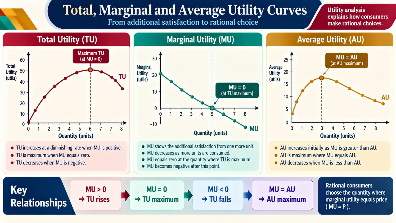
The total utility curve begins at the origin because zero consumption gives zero utility.
As consumption increases, total utility generally rises. At first, the curve can rise rapidly. Later, it becomes flatter as the additional satisfaction from successive units diminishes.
Eventually, TU reaches a maximum. Beyond that point, if further consumption produces negative utility, total utility begins to fall.
Why the TU Curve Flattens
The answer lies in marginal utility.
If each additional unit still gives positive satisfaction, total utility continues to increase. But if each successive unit adds less satisfaction than the previous one, the total utility curve becomes progressively flatter.
Thus, a falling MU does not immediately mean that TU is falling. As long as MU remains positive, TU is still increasing.
Marginal Utility Tells Us What the Next Unit Adds
Marginal utility is the change in total utility resulting from a change in quantity:
MU = ΔTU / ΔQ
Suppose total utility changes from 18 to 23 when quantity changes from 2 to 3:
MU = (23 − 18) / (3 − 2) = 5 utils.
That means the third unit adds five utils to total satisfaction.
The Meaning of a Zero MU
This is a particularly important point on the graph.
When MU = 0, another unit adds no additional satisfaction. At this point, TU reaches its maximum.
If MU becomes negative, another unit reduces total utility.
| Marginal Utility | Effect on Total Utility |
|---|---|
| MU > 0 | TU increases |
| MU = 0 | TU reaches maximum |
| MU < 0 | TU decreases |
The Shape of the MU Curve
Marginal utility generally slopes downward because additional units tend to provide progressively less satisfaction.
The curve may remain above the horizontal axis while MU is positive. It reaches the horizontal axis when MU becomes zero and moves below it when MU becomes negative.
This graphical movement corresponds directly to the behaviour of TU.
Average Utility Adds Another Perspective
Average utility is calculated as:
AU = TU / Q
For example, if a consumer obtains 23 utils from three units:
AU = 23 / 3 ≈ 7.67 utils.
AU can initially rise as average satisfaction increases. It later declines as the effect of diminishing marginal utility becomes stronger.
How MU and AU Interact
There is a useful relationship between marginal and average values.
When MU is greater than AU, the average tends to rise.
When MU is less than AU, the average tends to fall.
When MU equals AU, AU is at its maximum.
Sketching the Curves Correctly
When drawing utility curves, start with the axes.
- Place quantity on the horizontal axis.
- Place the relevant utility measure on the vertical axis.
- Draw TU as a curve that rises, becomes flatter, reaches a maximum and may decline.
- Draw MU as a generally downward-sloping curve.
- Draw AU as a curve that rises initially and later declines.
The curves should not be treated as three unrelated drawings. Their positions and turning points communicate economic relationships.
A Numerical Bridge to the Graph
Consider the following marginal utilities:
| Quantity | MU | TU |
|---|---|---|
| 1 | 10 | 10 |
| 2 | 8 | 18 |
| 3 | 5 | 23 |
| 4 | 2 | 25 |
| 5 | 0 | 25 |
Observe the pattern:
10 → 8 → 5 → 2 → 0
Marginal utility is falling. Meanwhile:
10 → 18 → 23 → 25 → 25
Total utility rises until marginal utility reaches zero. At that point, total utility is at its maximum.
A Quick Interpretation Exercise
Suppose MU is positive but declining. Is TU falling?
No. TU is still increasing because each additional unit is adding positive utility. It is simply increasing at a decreasing rate.
Suppose MU becomes zero. What happens to TU?
TU reaches its maximum.
Suppose MU becomes negative. What happens next?
TU falls.
From Graphs to Economic Meaning
The curves provide a visual language for consumer satisfaction.
A rising TU curve means total satisfaction is increasing. A flattening TU curve signals that each additional unit is contributing less than before. A zero MU identifies the maximum of TU. A negative MU shows that further consumption is reducing total satisfaction.
AU adds another layer by showing how much satisfaction is obtained per unit on average.
Final Takeaway
The three utility curves are closely connected:
TU measures accumulated satisfaction.
MU measures the change in satisfaction from another unit.
AU measures satisfaction per unit.
The key graphical relationships are:
MU > 0 → TU rises.
MU = 0 → TU is maximum.
MU < 0 → TU falls.
MU = AU → AU is maximum.
Understanding these relationships makes it possible to move confidently between utility calculations and utility curves.
Access NaCCA-aligned Support Packs
Download your structured NaCCA-aligned Teacher Support Pack and Student Learning Pack, designed for clarity, practicality, and reliable teaching and learning.